☰
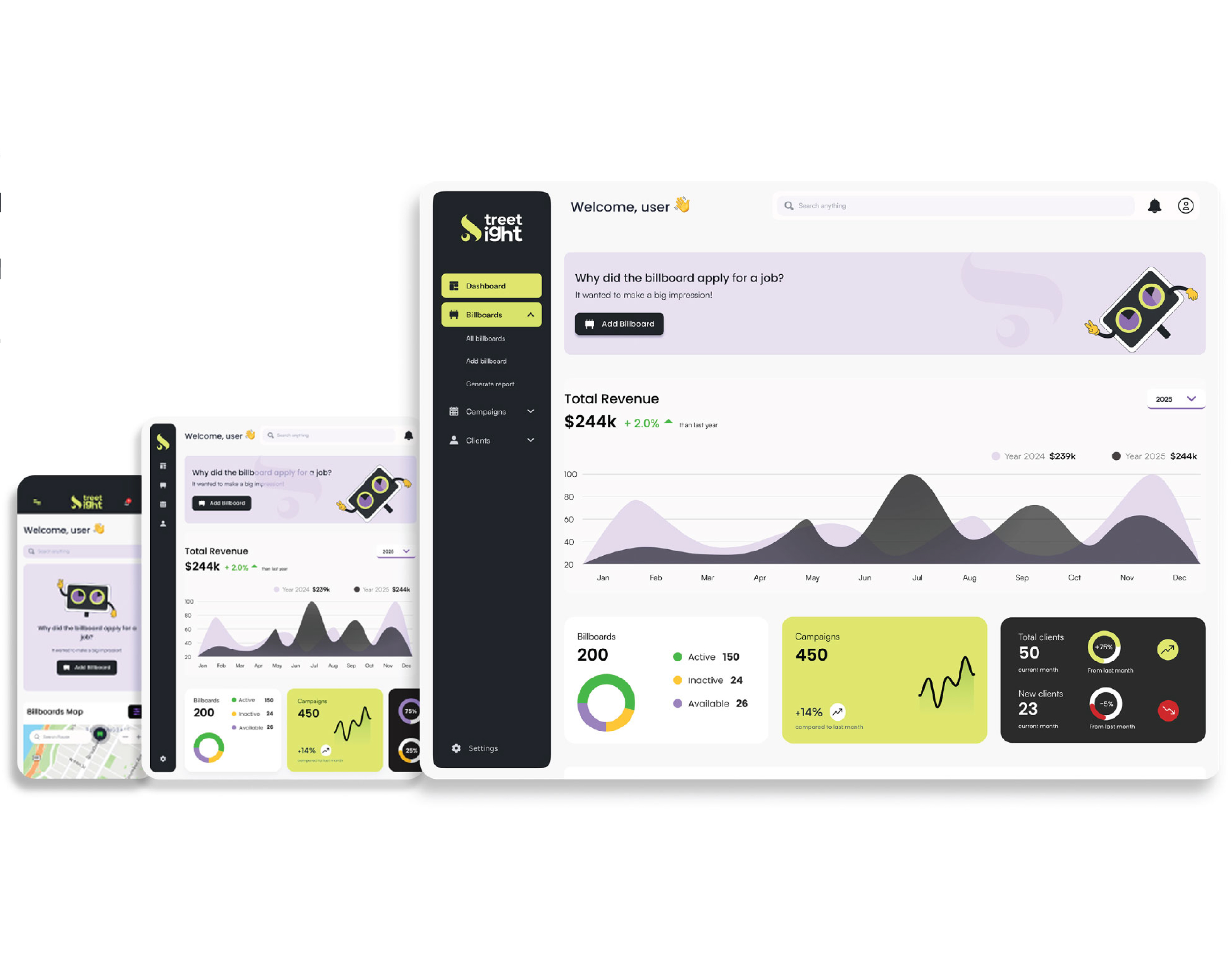
StreetSight is an AI-powered web application designed to revolutionize how advertising agencies manage billboard campaigns. With real-time data, interactive mapping, and automated tools, StreetSight simplifies tasks like proposal generation, invoicing, lease management, and performance analytics—bringing efficiency and clarity to the outdoor advertising industry.
Advertising agencies often struggle with managing billboards due to manual processes for proposals, invoicing, leasing, and performance tracking. This leads to delays, errors, and missed opportunities, making it hard to scale and maintain efficiency.
StreetSight solves this by automating key tasks like invoice generation, proposal creation, and lease management. It also provides real-time data and performance analytics, helping agencies save time, reduce errors, and improve campaign effectiveness.

The typeface used is Montserrat, a modern, geometric sans-serif font that conveys professionalism, clarity. "S" in the logo is a key visual element symbolising the routes and locations. Circular element within the "S" is like an eye hinting at observation.


Both typefaces were carefully chosen to complement and reflect the essence of the brand, creating a seamless and user-friendly interface. Both typefaces were carefully chosen to complement and reflect the essence of the brand, creating a seamless and user-friendly interface. Both typefaces were carefully chosen to complement and reflect the essence of the brand, creating a seamless and user-friendly interface.

Main font
Body font
Symbolizes stability, professionalism, and clarity. Its dark tone grounds the design while enhancing contrast for readability.
The vibrant shades of Lime Mist and Lavender Cloud, complemented by airy accents like Frosted Sky and Aqua Breeze, create a fresh, modern aesthetic that reflects innovation and energy—perfect for a forward-thinking digital platform.
Icons

Buttons

Pop-up's

Analytics

Client Card

Input Fields

Graph
.svg)
Dashboard Graph